Visualizing Air pollution in Bangalore using Brunel
Brunel defines a highly succinct and novel language that defines interactive data visualizations based on tabular data.
Brunel is Visualization language. It's a domain specific language. It has its own grammar. It feels familiar to anyone who thinks in data and want to visualize it. Brunel is also open source and works well with jupyter notebooks. In this post we will get the scraped data from pollution control department and try to visualize it using Brunel and IBM Data Platform.
Getting the data
Karnataka pollution control board has pollution sensors across bangalore. They publish the reports online. The scraped data is available on my github. Since scraping is not the point of this post, we are not getting into it. We will directly use the final data. The final data is in a CSV and looks like this
$ head data.csv
id,NO,station,key,year,date,from_time,RH,SO2,CO,O3,PM25,NOX,WS,WD,NO2,CH4,NH3,BENZ,TOLU,TEMP,SR,AT,PM10,PRES,ETHYL,NMHC,THC
1,2.12,BTM,BTM_01_05_2017_08_00_00,2017,01/05/2017,08:00:00,30.67,2.91,0.55,97.53,20.51,13.08,0.68,97.72,17.61,,,,,,,,,,,,
2,1.95,BTM,BTM_01_05_2017_12_00_00,2017,01/05/2017,12:00:00,23.54,2.43,0.71,78.73,17.22,13.13,0.68,124.9,18.48,,,,,,,,,,,,
3,2,BTM,BTM_01_05_2017_16_00_00,2017,01/05/2017,16:00:00,32.71,3.01,0.72,75.02,22.06,13.61,1.75,110,19.41,,,,,,,,,,,,
4,2.11,BTM,BTM_01_05_2017_20_00_00,2017,01/05/2017,20:00:00,57.1,1.9,0.81,81.75,26.85,14.92,1.36,141.97,21.9,,,,,,,,,,,,
5,2.05,BTM,BTM_02_05_2017_00_00_00,2017,02/05/2017,00:00:00,58.08,0.53,0.78,105.57,16.7,12.22,1.45,127.95,16.47,,,,,,,,,,,,
6,1.97,BTM,BTM_02_05_2017_04_00_00,2017,02/05/2017,04:00:00,60.72,0.21,0.69,58.36,13.85,14.06,0.46,117.94,20.36,,,,,,,,,,,,
Since I am worried about air pollution, PM2.5 and PM10 are the only concerned columns. Along with time and station. So we will deal with only with those columns currently.
Create a notebook, import data and clean
Go to IBM dataplatform and create a new notebook or you can visit my notebook on IBM or Githuband make a copy of it.
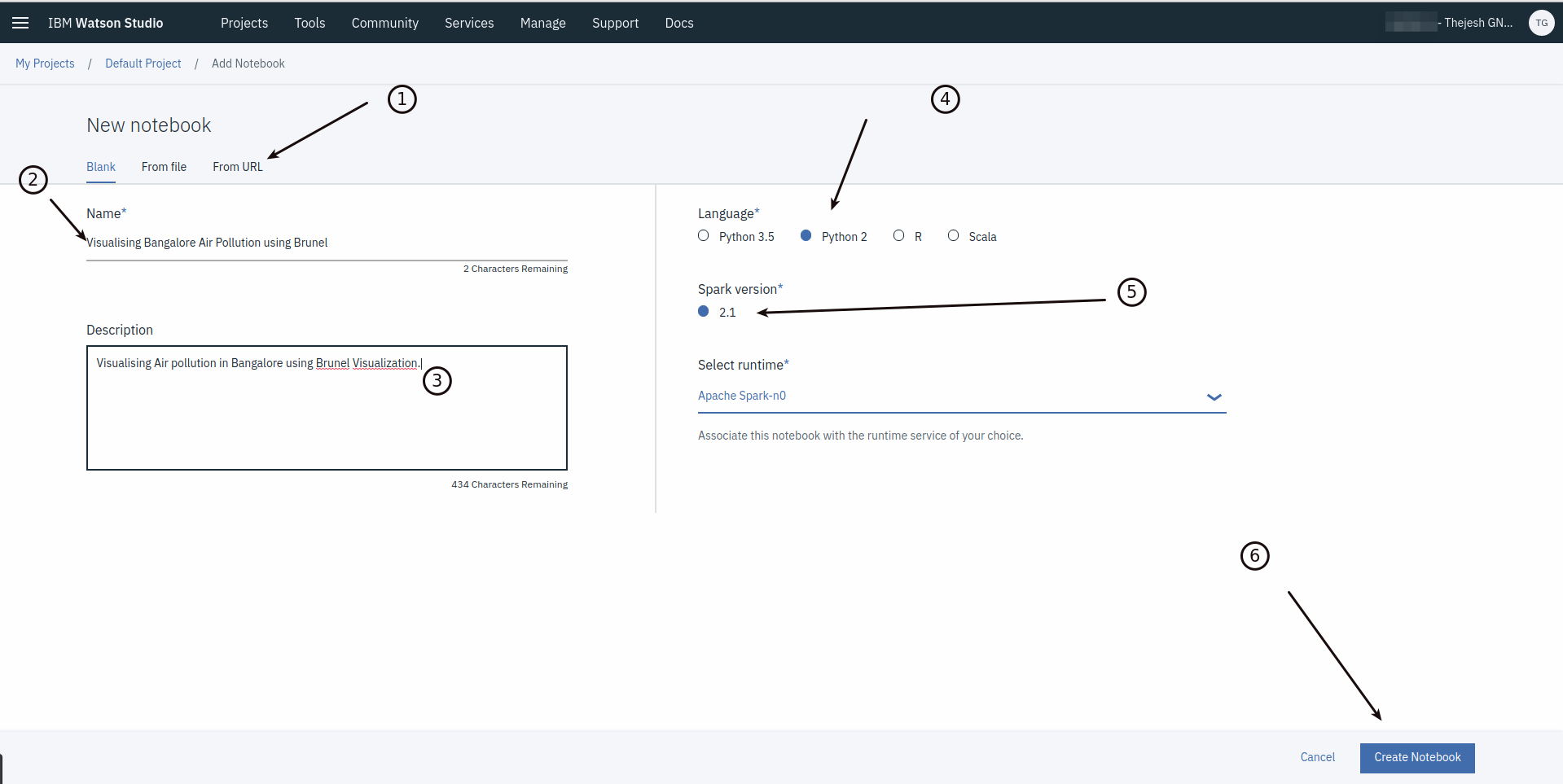
Create a notebook
Once you create the Notebook, first step is to import the data. I have two ways of doing it. In the first way, I use IBM files to store the data and pull from there. This is mostly for private data. It’s easy to do it. Just upload the file and import the code. IBM notebook automatically creates the cell with code required for importing CSV into a DataFrame. Be careful about sharing this cell info as it will have credentials.
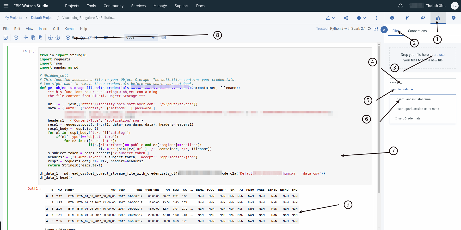
Uploading and importing a csv file
Second way is more for public data. Iust use requests to pull the data from a web accessible URL and import into a DataFrame. This is the method I will use here as the data is available on a public repo on Github. It can be achieved with 5 lines of code.
from io import StringIO
import requests
import pandas as pd

def get_file(url):
    resp2 = requests.get(url=url)
    return StringIO(resp2.text)

df = pd.read_csv(get_file('https://github.com/thejeshgn/cpcb_bangalore/raw/master/data/final/data.csv'))

df.head()
Next step would be to clean the data, which includes removing the columns that are not required, formatting the data etc. For example the date field
df['date'] = pd.to_datetime(df['date'], format='%d/%m/%Y')
Once its clean then we will get into the Visualizations.
Install and use Brunel
Brunel is made for Notebooks. It can be installed inside the notebooks with pip.
#install
!pip install brunel==2.3

#import
import brunel
Like we talked earlier brunel has its own language to define the visualizations. For example we can draw the scatter plot with just one line. Inside a notebook cell try
%brunel data('df') x(date) y(pm10) color(station) :: width=1200, height=300

Scatter plot of PM10
%brunel data('df') x(date) y(pm25) color(station) :: width=1200, height=300
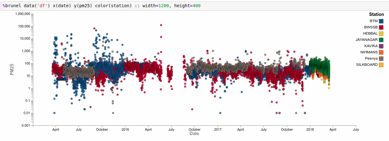
Scatter plot of PM 2.5
From these charts you could draw various conclusions about months when pollution is high and when its low. Maybe you can categorize the months as summer, rainy and winter to see if the season matters. You can also see anomalies (or wrongly reported data). For example BWSSB station has recorded value of pm25 as 65574.29 on 01/09/2015. It's clearly wrong. May be you can remove that value and replot!
%brunel data('df') x(date) y(pm10) color(station) line :: width=1200, height=300
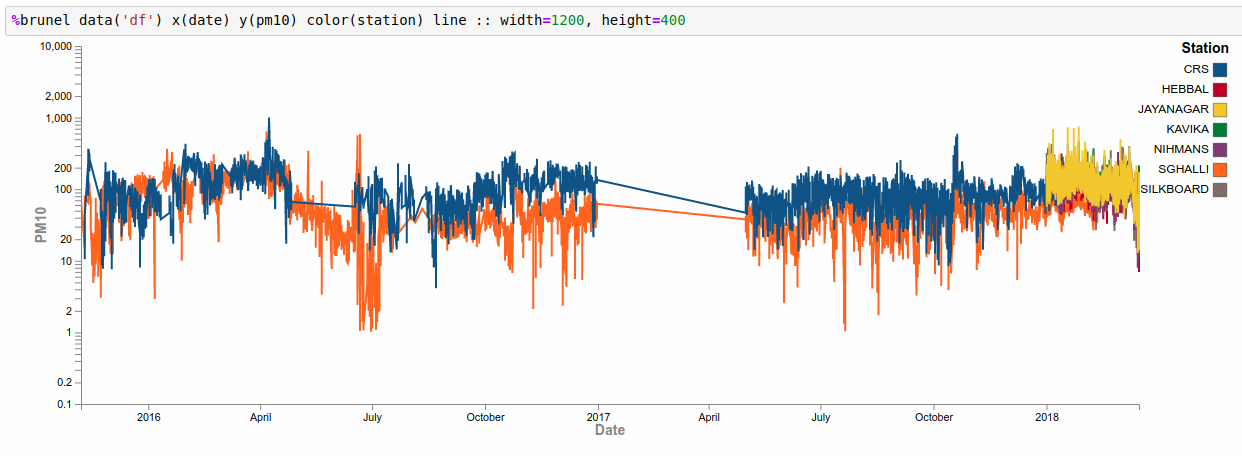
Line graph of PM 10
%brunel data('df') x(date) y(pm25) color(station) line :: width=1200, height=300
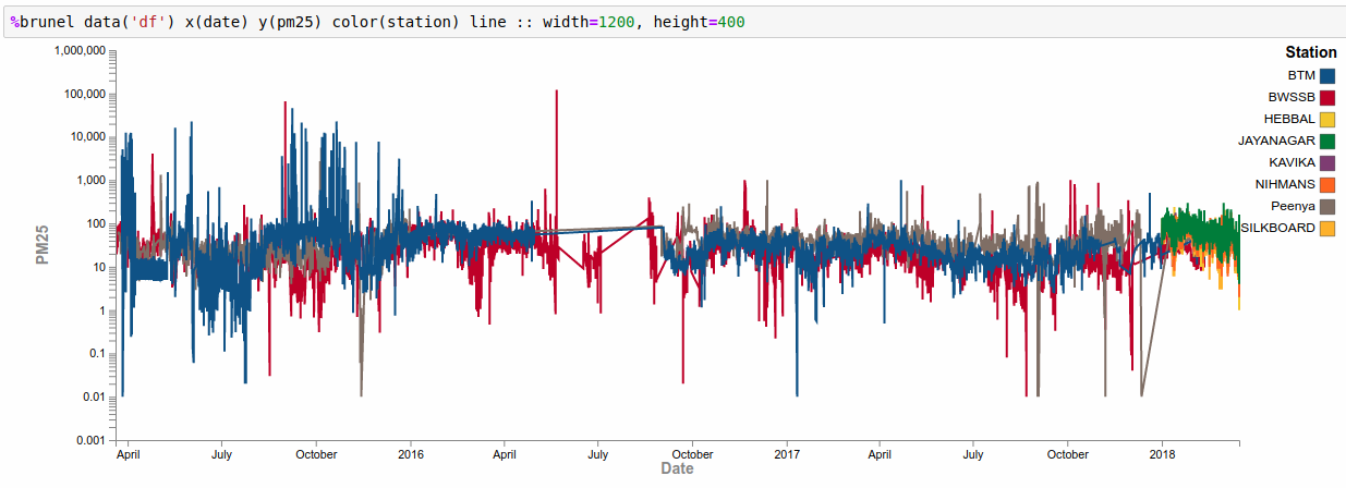
Line graph of PM 2.5
Simple line graphs also give you clear idea about the pollution. You can also see the missing data. The dataset contains other data like SO2, CO etc. I am mostly interested in PM2.5 and PM10 particles. You could dig deep into this dataset as it’s a fairly comprehensive dataset.
You can do a lot of other visualizations with simple Brunel definitions. As you can see it just takes one line to draw a graph and the statements are pretty much self explanatory.
Check Brunel Visualizations Cookbook. If you are short of time, just use my public notebook Visualising Bangalore Air Pollution using Brunel to experiment. If you have questions, let me know in the comments section.