How to Lie with Graphs
Recently I chanced upon these visualizations on Transforming India by Government of India. The site is recording of how India has been transforming since 2014. While going through them I found a few charts/visuals which Darrell Huff in his 1954 book How to Lie with Statistics talks about in the context of how graphs can be used to lie. Lets take look.
Objects in a chart
Here is an example from the book talking about using objects inside the chart.
From: The One Dimensional
The blast furnace representing the ten-million-ton capacity added in one decade was drawn just over two-thirds as tall as the
furnace representing the fourteen and a quarter million tons added in the next. The eye saw two furnaces, one of them
close to three times as big as the other. To say ‘almost one and one-half and to be heard as ‘three’ – that’s what the one
dimensional picture can accomplish.
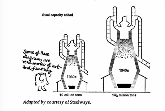
The chart uses the HEIGHT to represent the value 10 and 14 & 1/4 million tons. But the objects here have an AREA (size?). AREA is what user sees. Hence user is mislead to perceive 42.5% increase as ~200% increase. Now lets see an Indian example

First Graph: Average output per ship berth day. Lets calculate the percentage.
(14576−13748)÷13748 = 0.060226942
0.060226942 * 100 = 6.02269421%
So it’s roughly 6% increase. And hence the second image should have just 6% bigger (AREA) compared to first. But bigger ship looks at least three times (300%) the smaller ship. Misleading.
Second Graph: Turn Around Time
(3.63−3.43)÷3.64 = 0.054945055
0.054945055 * 100 = 5.4945055%
So it’s roughly 5.49% decrease. But again the second anchor looks at least one-third the size first one. Misleading.
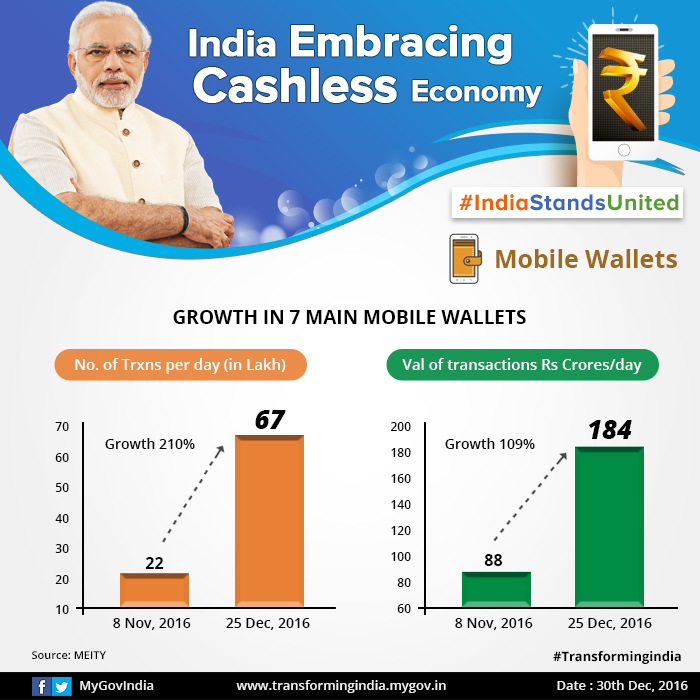
Y-axis doesn’t start at zero
Again from How to Lie With Statistics, you would have learnt any graph whose Y-axis doesn’t start at zero is cause for suspicion. It may not always be misleading but needs to examined, specially if they are bar charts. Here is an example that talks about growth in mobile wallets. Lets take the first example, It talks about the ‘No. Transactions per day (in Lakh)’. The graph is supposed to depict 210% growth. Does it? Compare the sizes of bars. To make it easy I have added an extra bar by copy pasting the smaller bar multiple times. Isn’t it misleading?
Y-axis doesn’t start at zero
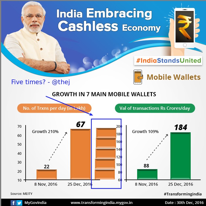
I have added one more bar copy pasting the first to show how much the second bar represents.
Some more examples of Y-axis doesn’t start at zero

Misleading: Red bar is at least 4 times bigger

Misleading. Red bar is at least 4 times bigger than blue.
I am planning to do more posts under a broad category DataCanLie. Let me know what do you think of this series?


fantastic and quite revealing. please do more.
Its a shame the charts “lie” since the underlying statistics are still pretty impressive.
If the government “propaganda” department had presented the information honestly
the results are still impressive and we could be doubly impressed with an honest presentation.
Great observation. Why are they trying to fool the public when there is 210% growth? Unless even the data they are presenting is also inflated.
Love this! Need more of these exposés.